matplotlib 이란?
- python에서 시각화할 수 있는 대표적인 패키지
- python과 pylab이란 sub 패키지가 있다.
| pyplot | pylab | |
| 기능 | 시각화 | 시작화 + numpy |
| 특징 | 비대화형 (간단한 정보만 입력해서 플롯이 된다) |
대화형 (비교적 많은 정보를 입력해 플롯을 요구한다) |
- import matplotlib pyplot as plt
1. matplotlib 이해하기
| 스타일 옵션 종류 | marker 종류 정의 | 약자 |
| color | 선 색깔 | c |
| linewidth | 선 굴기 | lw |
| linestyle | 선 스타일 | ls |
| marker | 마커 종류 | |
| markersize | 마커 크기 | ms |
| markeredgecolor | 마커 선 색깔 | mec |
| markeredgewidth | 마커 선 굵기 | mew |
| markerfacecolor | 마커 내부 색깔 | mfc |
# line plot
x = [1, 2, 3]
y = [2, 4, 6]
plt.plot(x, y)
# line plot
x1 = [1, 2, 3]
y1 = [2, 4, 6]

x2 = [1, 2, 3]
y2 = [2, 3, 4]

# plot = 그래프 그리기
plt.plot(x1, y1)
plt.plot(x2, y2)

# show = 출력
# show = 원하는 곳에서 출력하기위해, 이 코드 위에까지 그린 그래프를 출력하기
plt.show()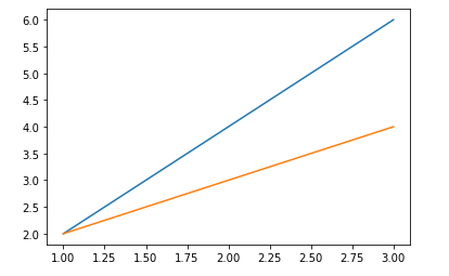
2. Line style

# line style
plt.plot(x1, x2, ls='--')
plt.show()
3.marker

# marker
plt.plot(x, y, marker = 'o')
plt.show()
# markersize
plt.plot(x, y, ms = 10, marker ='o')
plt.show()

4. line width
# line width
plt.plot(x, y, lw = 50)
plt.show()
5. line color
# line color
plt.plot(x, y, color = 'yellow')
plt.show()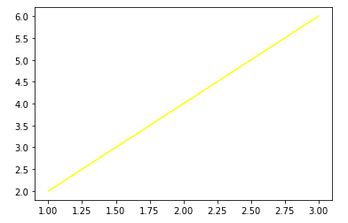
6. 그래프 꾸미기
# 그래프 범위 지정
plt.plot(x1, y2, label = 'blue')
plt.plot(x2, y2, label = 'orange')

plt.xlim(-2, 10) # x축 범위 지정
plt.ylim(-5, 12) # y축 범위 지정

plt.xticks([0, 5, 6, 8]) # x축 값 지정
plt.yticks([0, 3, 6]) # y축 값 지정

plt.grid() # 틱 위치 보기

plt.legend() # plot에 있는 label 출력(반드시 적어줘야만 출력 됨)

plt.xlabel("X축") # x축 이름 달기
plt.ylabel("Y축", rotation = 0) # y축 이름 달기

plt.title('그래프 제목') # 그래프 제목 달기

plt.show()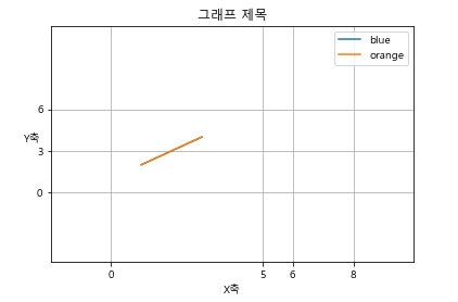
** 알아가기
제목으로 한글을 원하다면 아래와 같이 써주기
# 한글 인식하게
from matplotlib import font_manager, rc
font_name = font_manager.FontProperties(fname ='c:/Windows/Fonts/malgun.ttf').get_name()
rc('font', family = font_name)
728x90
반응형
'언어 > Python' 카테고리의 다른 글
| Python_Traffic_Accident(실습) (0) | 2022.06.23 |
|---|---|
| Python_경찰청 데이터 분석(실습) (0) | 2022.06.23 |
| Python_데이터 합치기 (0) | 2022.06.22 |
| Python_나이 데이터 분석(실습) (0) | 2022.06.22 |
| Python_pandas_학급별 데이터 분석(실습) (0) | 2022.06.22 |